30/10/2013

STUDY TASK 1 - WHY AM I HERE? WHAT DO I WANT TO LEARN?

Identify and explain 5 reasons why you chose to study on this programme.


  • I chose to study this programme because I want to learn about illustration.
  • I am interested in the many different types/possibilities of illustration and I want to refine my skills. 
  • I also want to be surrounded by people who share my interests in art/drawing/illustration and see other peoples work. 
  • Out of all the other courses I looked at, this one looked the most exciting and the tutors were passionate.
  • It is a full time course, seems well structured and I work well with routine and deadlines.
Identify and explain 5 things that you want to learn during your time on the programme.

Over the next three years, I want to learn about the illustration industry; 
  • what will be expected of me as a professional illustrator? 
  • different areas of illustration - which one suits my skills best and which do I enjoy the most?
  •  how will I establish myself as a professional illustrator when there is so much competition?
  • what is my tone of voice and what do I have to say?
  • I'd also really like to learn more about how to form a narrative and work on comic strips. 
Identify and explain 5 skills that you think are your strengths.


  • I have a background in photography - I could use this alongside my illustrations or gather good quality photographs for reference material. 
  • I am very familiar with Photoshop. This will help me expand the possibilities of my work. 
  • I am organised and work well with deadlines
  • I am dedicated to learning about my craft
  • I really want to push my skills further and try out new processes


Identify and explain 5 things that you want to improve


  • The way I generate ideas - I want to try out lots of new media and really explore every aspect of an idea/concept. 
  • My confidence with line - I want to stop drawing with sketchy lines.
  • Range of materials used
  • Knowledge of other illustrators/creative practitioners
  • My ability to trust my own ideas - stop putting them down and believe that they might actually have potential

Identify and explain 5 ways in which you will evaluate your progress
  • Compare work produced last year with the work I am producing now and see how much/if anything has changed.
  • Constantly reflect on what I am working on - am I happy with this media in particular? Has the way I generate ideas changed? Etc
  • Make regular posts on my blog evaluating different stages of projects
  • Keep a sketchbook - I know I won't get better at drawing if I don't draw over and over. 
  • Take regular breaks to step back from work and be critical of it - how could it be better? does a particular aspect of it really work?

29/10/2013

Photoshop Inductions


This picture of frankenstein was originally part of my visual language task which was to explore different types of drawing tools. I made the original using black acrylic paint with a brush in my sketchbook. I then used the skills I have learnt in the last few sessions of the photoshop inductions. To begin with, I had only planned to add texture to the face and leave the background plain white. However, I ended up really liking the texture all over the image - it reminds me of a piece of graffiti on a concrete wall. 
I purposefully left the edges of the drawing quite rough so that it still looks hand drawn - although I could create a sharper version using photoshop or illustrator quite easily.


This is another piece from the visual language task. It is a monster from the film Beetlejuice directed by Tim Burton. I produced the image using ink and the back end of a paint brush. The jagged, rough lines gave the overall image quite an aggressive, scary feel and so I wanted the colours to reflect this. I used dark, broken colours and when applying textures knew I wanted them to be grungy and dark. 
I think this image would have been much more effective if the composition was slightly different. I could have included more of the monsters neck and maybe even a poor victim below. As the original was only on a piece of A5 paper,  I could always do another version on a larger scale to play with the composition and add more subjects. 


26/10/2013

STUDY TASK 2 - 'What is illustration ?' - Part 1

 Source, present and blog. examples of contemporary Illustration that reflect you rown individual creative interests. Choose 5 criteria from the list below that will guide your selection of work;

  • Use of Media & Method of Production


LIZ CLEMENTS


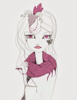
I really like the method Liz Clements uses to produce her work. She draws the illustrations out by hand using a variety of soft pencils to sketch and harder pencils to line. She then scans the work and adds colour using photoshop. I think it gives the images a very finished, professional feel whilst still retaining that hand-drawn finish.I have been practising this method during our photoshop inductions. 
Although Clements calls herself an illustrator, I am unsure whether or not these pieces really fit my definition of illustration. I don't know what is being said in these pieces nor do they voice Clement's opinion. I could be wrong and this is just my opinion, but I would say these are just nice artwork. 

PETRA DUFKOVA
I love the simplicity in this method. There are very few lines or brush strokes that appear to make up this image but they are all very controlled and flowing. I would really like to try this with some of my work using wet media such as inks or watercolours.

KELLY SMITH

Although I am not quite sure how this image was made, I can guess that it is made up of a few different images all merged in photoshop. I really like the contrast between the monochrome drawing, the textured but surely digital background and the controlled splashes of paint. I think this is a really good example of experimenting with different media within one piece of work. 

JUDITH VAN DEN HOEK
I really like the use of coloured paper/stock in Hoek's work. I think it gives it a depth you cannot achieve with just white paper. I think the media used for this piece is really effective too because its simple, but nicely textured whilst being smooth. This is another use of media that I'd like to try.

ANDRE BERGAMIN
Bergamin used collage/photomontage to create his pieces of work. I really like the concept of taking an image out of context and putting it with others to create a whole new piece. 


  • Coceptual development, sketchbooks development work 


  • Debra McFarlane
    I really like that McFarlane has parts of her sketchbook among her online portfolio. I think it gives an idea of how artists like to work and how it is embedded in their daily routine. I love her sketches of people on the tube (pictured above) and I think it's a really great way of practicing human proportion, expressions etc. 

    Ping Zhu
    Since being shown Ping Zhu's work, I have fallen in love with her sketchbooks. Not all of the pages are covered from top to bottom, often they are quite simple. But they show exploration with line and shape. They are clearly a continuous thing, which I find inspiring and aim to do myself. 

    Joao Ruas
    I love the amount of consideration and time you can tell has gone into these pages of this sketchbook. The colours are very loose but still considered. The lines are confident and continuous whilst still being loose and sketchy. Although this is probably only an idea/concept that Ruas has thrown onto paper, I think it still works as an unpolished piece of work.

    Andrea Joseph
    When I came across Jospeh's sketchbooks, I instantly fell in love with the mish mash of text and images. The whole page looks personal to her and is crammed with ideas, thoughts and even memories. I love that the whole page has been filled - it gives a sense of continuous thinking and idea processing that isn't just through image. 

    Jorge Mascarenhas
    I think these two pages of this sketchbook are quite expressive. The overall feel is quite sad but it's still capturing and interesting to read. The images and the text form a narrative which aids the illustrator in portraying a particular feeling/mood. I think this is a nice touch for a piece of sketchbook work and makes it a little more personal. 


    • Humour


    I selected all of these images for this category because I think they're all effective in communicating a joke. They're all pretty simple drawings - cartoon style, simple lines a little shading and small amounts of text. Most of the text is short dialogue for the characters and I think because of their simplicity they have a narrative and are relate-able. 
    I think that with humorous illustrations, they have to be kept simple so the humor is instant. 


  • Concept art and visualization.


  • This is a piece of splash art for a game showing one of this characters different skins. This kind of image gives the skin/style context as well as being visually capturing. The composition is clearly well thought out and create a line of sight directing the viewer to the character. 

    A page from Hyrule Historia. A book containing all the different concept art for both characters and landscapes for the game series The Legend of Zelda. As a big fan of this game series and of character design, I found this book really interesting as it gave me a glimpse of the different processes they went through to develop the characters. 

    This is a piece of concept art for the game Bioshock Infinite. It is one of my favorite games and the image above represents the kinds of colours used and the context in which the game takes place in. 

    Concept art for The Last of Us (game). The use of a limited colour palette really helps to create a visual image of this scene. As well as portray the scene, it helps to paint a picture of what kind of relationship these characters have, even during a zombie apocalypse. 

    Concept art for the film Captain America. This piece of work gives a clear representation of the context of the film and symbolism. It is showing Captain america as a symbol of hope and strength for America during a time of war and destruction.


    • Socio / Political Meaning or Message


    • These are all pieces of illustration formed with some kind of opinion on a current political situation. The aim of these is to make the viewer agree or understand that opinion. They are usually caricatures of political leaders of other people in power, degrading them to make them appear stupid. I don't think these are very good examples for this category. I think that politics affect lots of different types of illustrations in some way - I need to look at more contemporary practitioners to inform myself on this. 


      23/10/2013

      Mark Ryden


      Mark Ryden is an artist I have been interested in for a while. I love different aspects of his work, such as the colour palettes, childish visual symbols as well as the skill and time contributed to each piece.


      After the lecture and seminar on signs/symbols, I have started to notice them more so within Rydens work. For example, in the bottom image, I can see the symbol of Islam, some writing in another alphabet and an eye that appears in most of his paintings.I think all the symbolism gives the images quite an insidious nature and I am very interested in learning what kind of concepts Ryden is communicating. 


      22/10/2013

      Photoshop Inductions


      The gif above displays the steps of my image development.

      I began with a scanned drawing from my sketchbook and adjusted the levels accordingly to make the lines darker. I then used the healing tool to clean it up (removing any dirt etc). I then used the magic wand tool to select and mask out the background - this would allow me to change the background color later without it affecting the main image. 
      To begin colouring I used a 'Multiply' layer which allows you to colour over lines without it blocking them out. I then used a separate layer on normal blending mode to create an opaque background.
      Once the image was all coloured in, I found some textures using google (however, you can also scan objects etc or use photographs) and applied them to the area I wanted by masking them and selecting an opacity that looked good. 


      I found this session very useful and really love my outcome. I think it is a fantastic way to create digital artwork that still has the texture and line-work of hand-drawn pieces. 


      15/10/2013

      Examples of Illustration

      In our 'blog groups' we were asked to come up with five categories within illustration. After discussion of what illustration involves, my group came up with; Illustrative Products, Illustrators, Opinions, Messages and Concepts, Entertainment Design and Application of Illustration.

      Here are some examples:

      Illustrative Products


      Illustrators 

      Yaeko Abe

      Montana Forbes

      Sara Hingle

       Zoe More O'Ferrall

      Kena Ravel


      Opinions, Messages and Concepts


      Entertainment Design


      Application of Illustration